RESEARCH
The following step involved comprehensive research on the provided information and seeking out
suitable images for reference in alignment with the task. For example, when investigating the
tea-making process, research was done to acquire references and enhance comprehension of the
procedure. This was undertaken to cultivate a deeper understanding of the provided concept and
facilitate thorough coverage of the topic.
LAYOUT
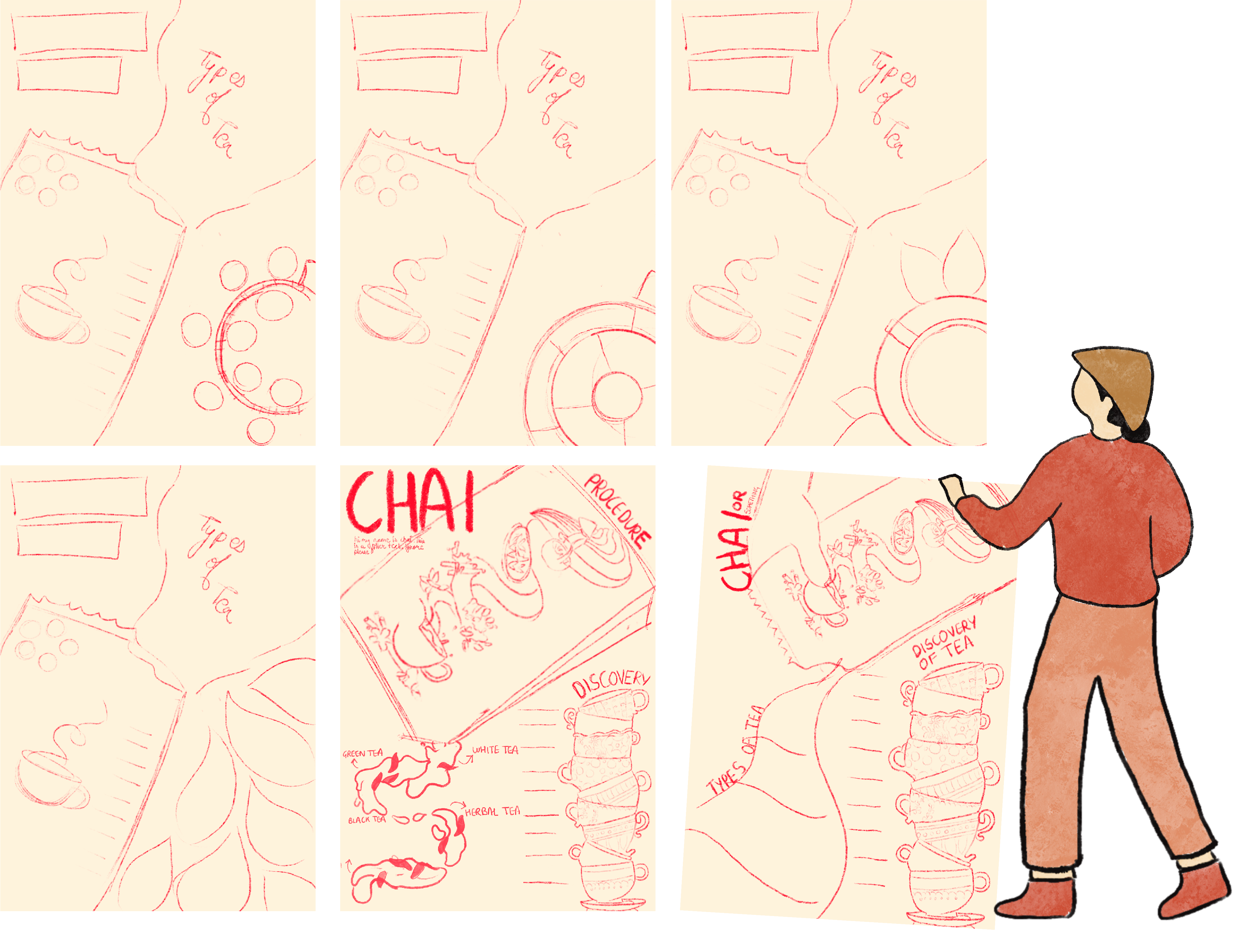
Different layout options were explored to identify the most suitable one that best emphasized
hierarchical elements.
iterations-
ILLUSTRATION
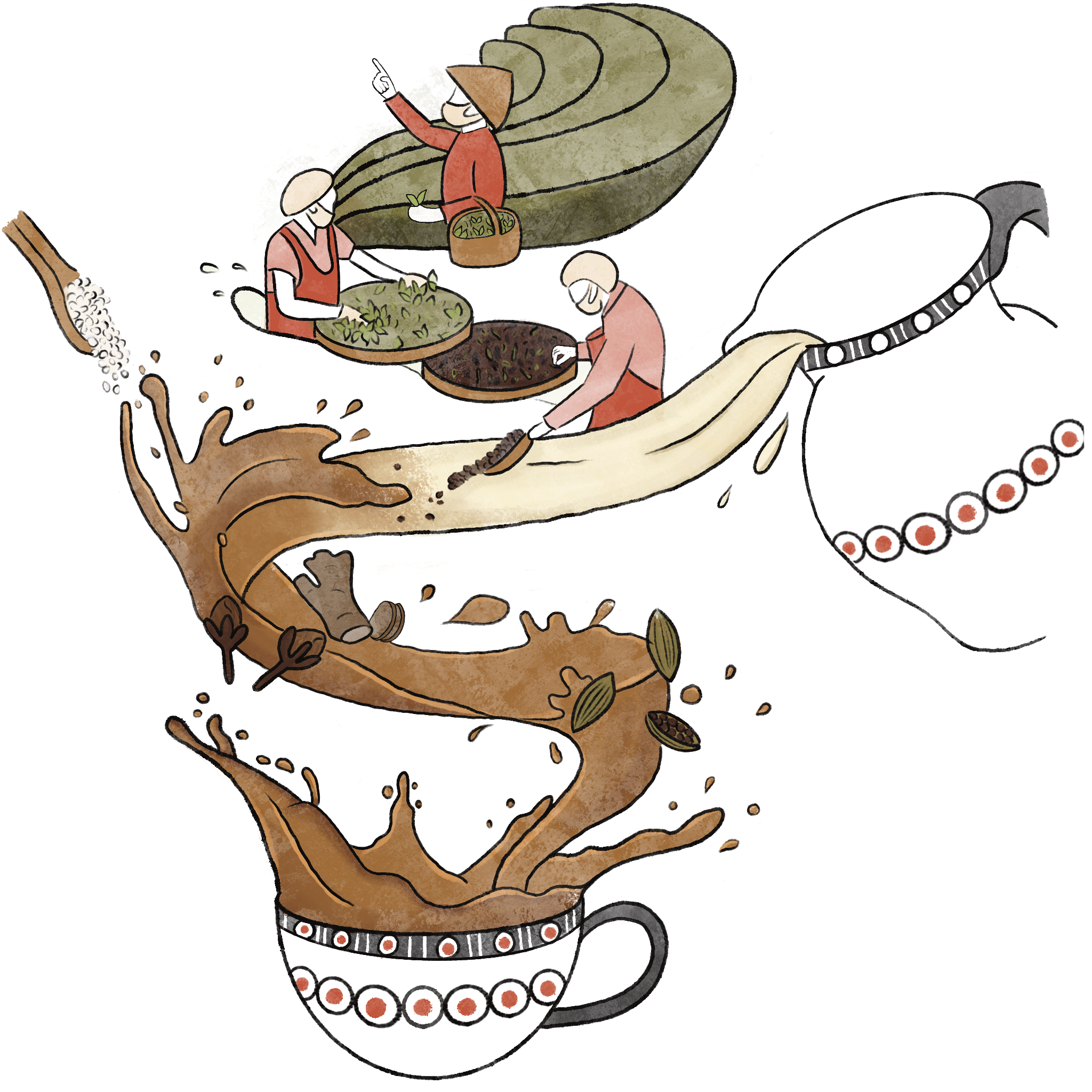
I proceeded to create illustrations and icons specifically tailored for the infographics, simplifying
the original reference images into more streamlined forms. Selecting a color palette was crucial,
with a maximum allowance of five colors. I opted for a serene and earthy palette, inspired by the
tranquil surroundings of tea plantations nestled in the hills. Additionally, the illustration style
was intentionally kept organic, avoiding clean, straight lines for a more raw and natural aesthetic.
TAKEAWAY
As the project neared completion, the final step involved assembling all elements within the
compositions. However, this stage presented challenges, particularly in integrating text alongside
illustrations. While the illustrations offered visual cues, strategic placement of textual elements
proved essential. This experience underscored the importance of meticulous layout planning. Despite
initial reservations about pursuing infographics instead of my desired elective, the entire process
proved to be an immensely enriching experience. From digital design to printing on A2-sized paper,
the process afforded invaluable insights. I grappled with ratio sizing nuances and color fidelity in
print, while also recognizing the impact of font size on readability.The transition from digital
creation to physical printing unveiled distinct considerations, highlighting the unique intricacies
involved in both processes.


.png)